 Blogs
Blogs
Designing The Information Architecture (IA) of Mobile Apps
Any mobile application is all about the content it is based on and the way it is organized. Your texts, visuals, videos, audios, etc. can be awesome on their own, but if you make it too complicated for the user to reach them and enjoy their awesomeness, your app is doomed. So, if you want to design a perfect user experience, you need to put a lot of thought into how you organize the information in your app to make it convenient and pleasant for the user – i.e. you shouldn’t underestimate the importance of mobile information architecture.
What Is Information Architecture?
First things first. The information architecture of any app or website is, basically, the outline of the information in it; it is the structure of your app’s content. The main aim of the designer working on the IA is to make it simple and intuitive to navigate. This process is very similar to how architects invest their time and effort in creating blueprints and figuring out where the building’s main elements should be located to be easily accessible to residents.
There are two core principles you should stick to while creating the IA:
- it has to be easy to comprehend and navigate;
- it has to be easily scalable (i.e. it has to be easy to add new features to the app after its release).
IA of Mobile Apps: What You Should Know
The reason why we need to talk about the differences in the IA of mobile apps and desktop apps or websites is pretty obvious: using a smartphone is qualitatively different from using a PC. There are two main things that you should take into account:
- Device Specifics. First and foremost, the user interaction with a smartphone is based on swipes and taps instead of clicks and keyboard shortcuts. The screen is significantly smaller, so fewer elements can fit into it. Besides, the mobile internet connection may not be as high-speed as the one at home (depending on the country, the user’s location and the cellphone operator services quality), so mobile apps should be optimized for loading time.
- Circumstances. People use their smartphones while they are walking from point A to point B or are on the public transport. So, you should take into account all the distractions your users may be struggling with, including various viewing conditions, while using the app.
All of these differences require IA designers to rethink how the content should be presented in a mobile app to provide seamless UX.
Top 6 Mobile Information Architecture Patterns
There is no need to reinvent the wheel: there are numerous IA patterns that can make it easier for you to design your app’s basic structure. The only thing you need to think carefully about is which patterns to choose from.
Before we start, take into account that you are not supposed to choose only one mobile app information architecture pattern and use it throughout the whole app. You can choose several patterns and combine them any way you want to. However, keep in mind that you need to choose the parent pattern, and then you can use other patterns for subsections.
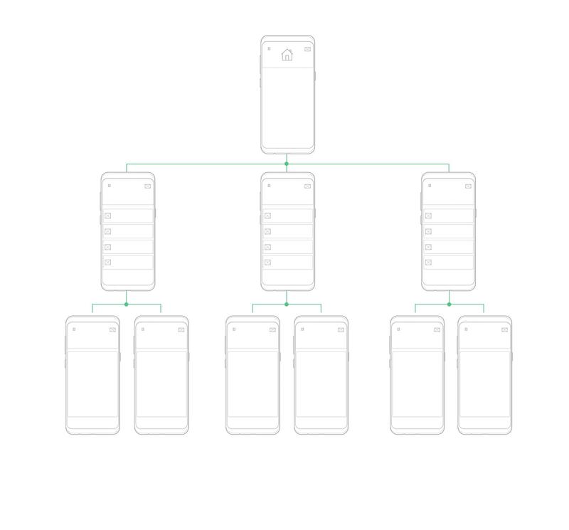
1. Hierarchy
This pattern is used for websites; however, it has found its application in mobile app design as well. Basically, you create one index page that has links to other pages, which in turn can also contain links to more subpages.
What It Should & Shouldn’t Be Used For
This pattern is a good fit for mobile apps that have to have the same structure as desktop websites. However, if you get a multi-faceted navigation structure as the result of using this pattern, it can be inconvenient to use on small screens. So, in this case, it is better to reconsider your choice and opt for another pattern with less complicated navigation.
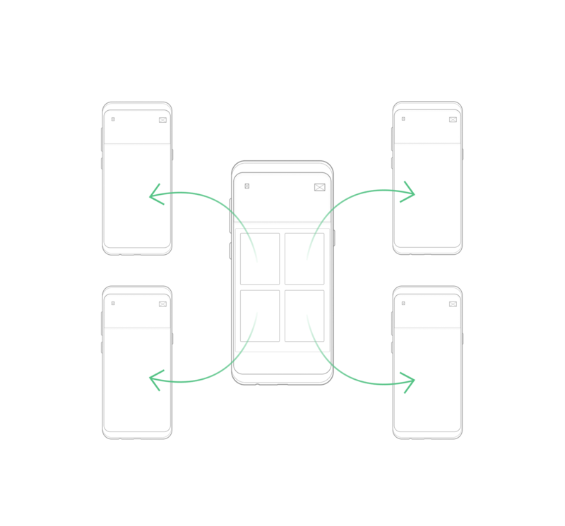
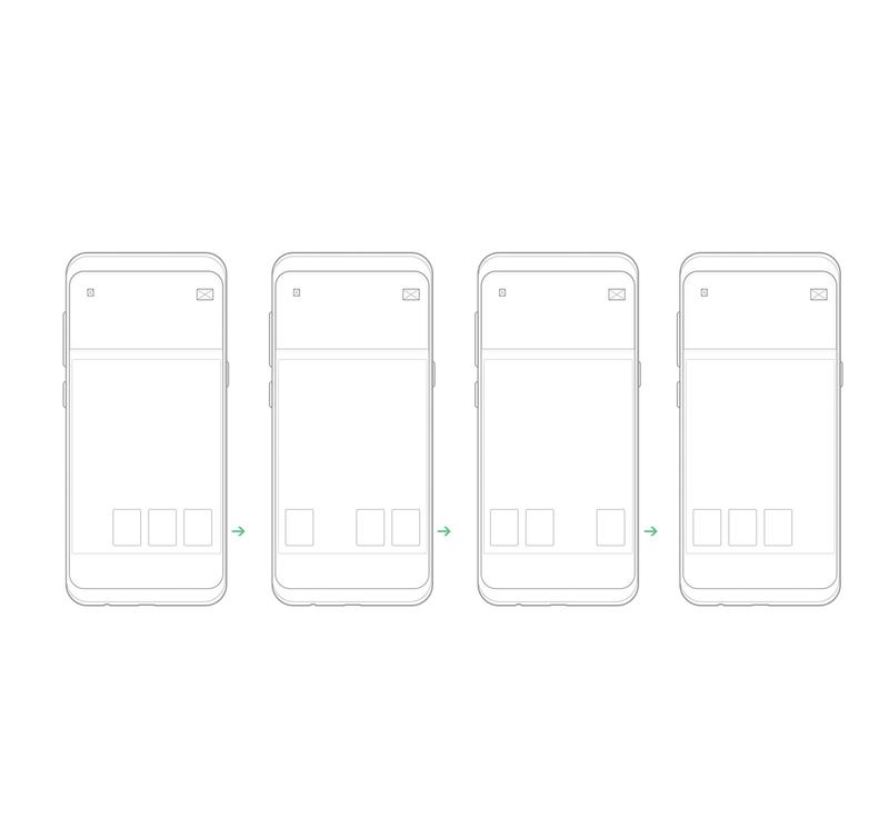
2. Hub & Spoke
This pattern is the default for iPhone apps. Here, you have one index page (the so-called hub) with spokes to navigate to. In order to switch to another spoke, users have to go back to the hub first. Therefore, this pattern encourages users to focus on one task at a time.
What It Should & Shouldn’t Be Used For
This pattern is good for multi-functional apps where each tool or feature has its own purpose and internal navigation. However, if your app is aimed at users who would like to multi-task, this pattern won’t work well.
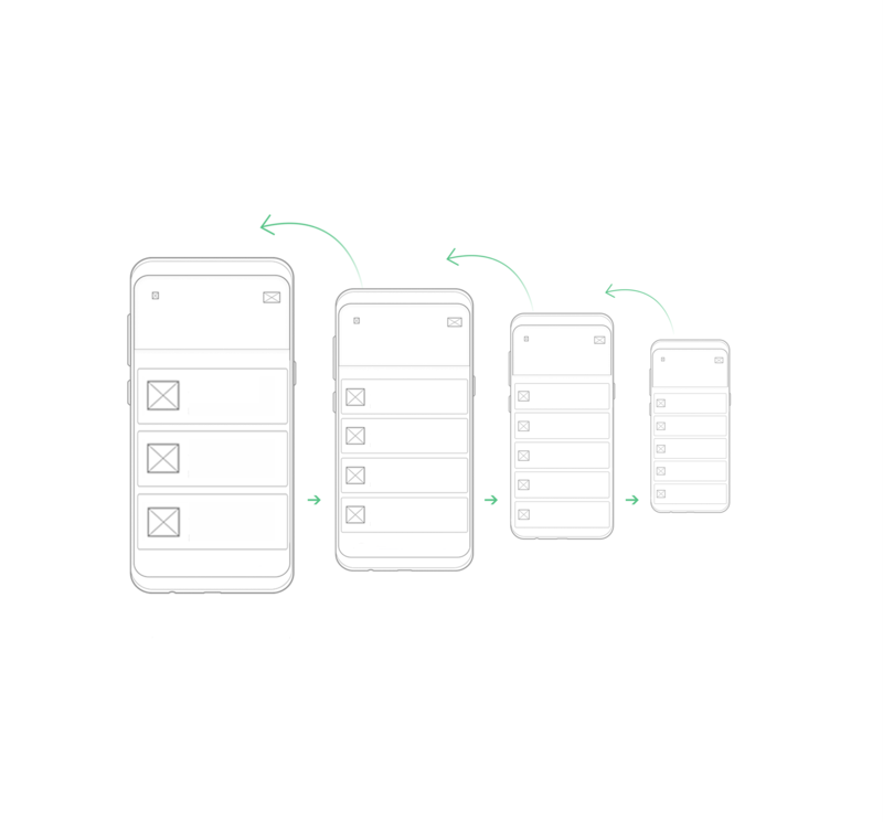
3. Nested Doll
This one is a linear pattern that allows users to move from the index page with a general overview of the content to the pages with more details. As it is linear, the navigation is perceived to be clear, so users are less likely to get lost in the app’s content.
What It Should & Shouldn’t Be Used For
It has found a wide application on Android. The nested doll pattern is a good choice for apps that are focused on one particular topic or a couple of closely related ones. However, consider that it may be too slow to switch between sections if you have many levels in your IA.
4. Tabbed View
This mobile app information architecture pattern is going to be extremely familiar to any user because it resembles the way tabs are organized on desktop browsers. The content is placed into different sections, and users can switch between them using the toolbar.
What It Should & Shouldn’t Be Used For
This pattern suits apps that are created to be tools (e.g. for searching and comparing products from many categories and sub-categories; a great example is Amazon with their tons of goods and accessible tabbed navigation to browse through them) and to encourage the user to multi-task. However, watch out for the complexity of your IA with this pattern – you should keep it as simple as possible to make it user-friendly.
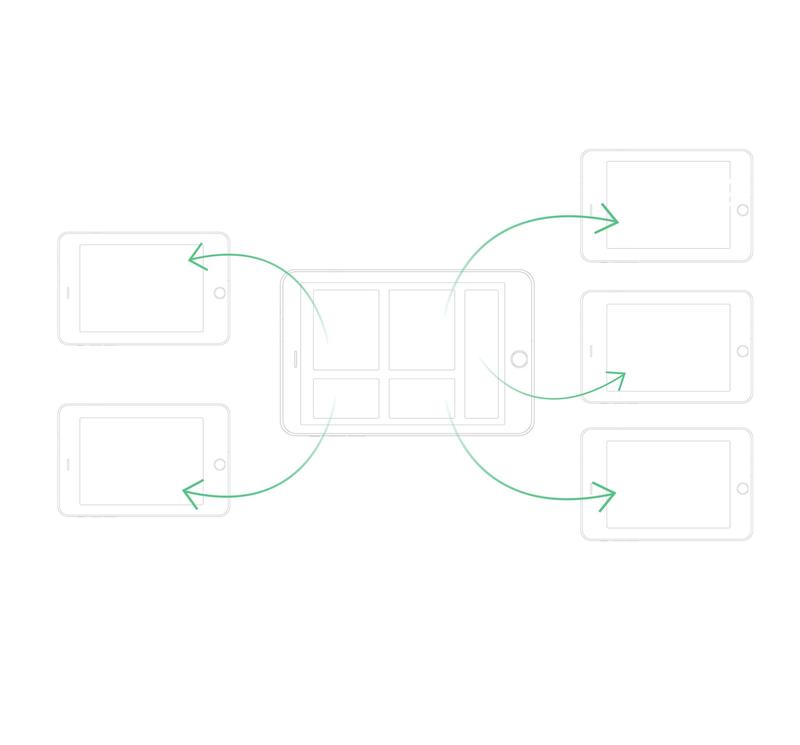
5. Dashboard
This framework has different elements that display a part of the information (for example, content or tools) on the index page. It has one significant advantage: it allows users to consume the most important information, analyze and prioritize it at a glance.
What It Should & Shouldn’t Be Used For
It is a good fit for apps that are built to be used on a tablet rather than a smartphone. It suits apps that are content-based and multi-functional tools. However, it is quite easy to overload the index page with elements and make your users feel lost in a sea of information as a result. So, you should pay particular attention to testing how users interact with this interface and use their feedback to improve the UX.
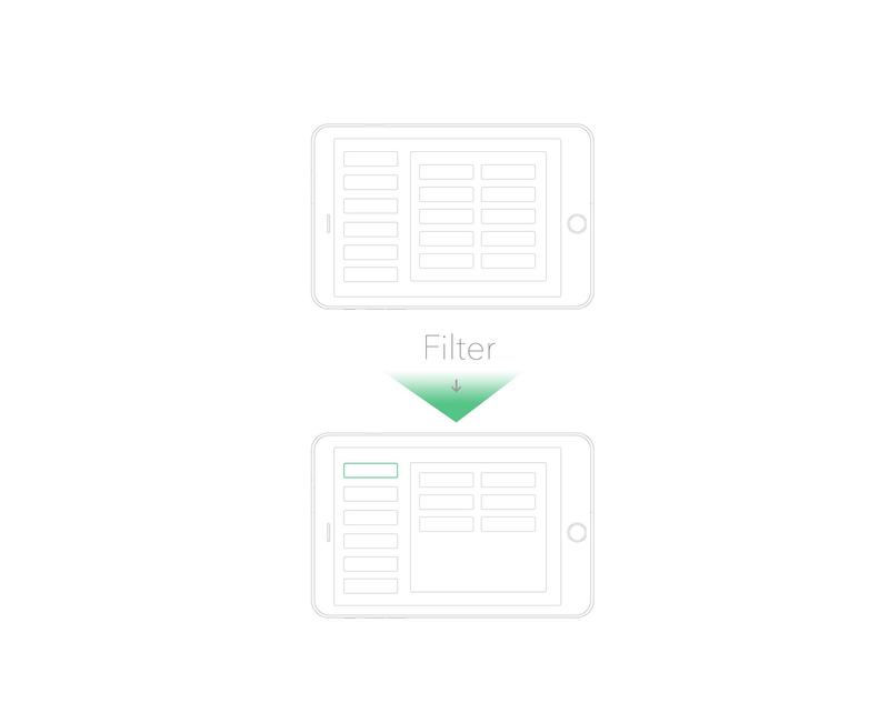
6. Filtered View
Filtered view allows users to switch between alternative views by filtering the content they are seeing. This pattern is great for giving users the freedom to choose how to explore the content themselves.
What It Should & Shouldn’t Be Used For
This pattern is an excellent choice for apps that are based on displaying huge amounts of content (images, videos, etc.). However, it shouldn’t be overloaded with too many filters as this would make it difficult to display them on a small smartphone screen.
6 Tips for Designing a Good Mobile Information Architecture
#1. Create the Content Inventory First
Before you even start considering which pattern to choose for your IA, you need to know what elements your IA will consist of. So, we suggest making a list of all the content that needs to be in the app: all the titles, meta elements, audio files, videos, texts, documents, etc. This will help you group the components, prioritize them, and get rid of those that are unnecessary.
#2. Don’t Forget about Wireframing
Wireframing means sketching the schematic images of what the app will look like. It is not focused on the details of the design but rather on how the IA elements can be organized. Wireframing is used to visualize the ideas of how a certain page or a screen can look, and it is useful for presenting and discussing these ideas with other stakeholders.
#3. Keep It Simple
This is, perhaps, the most crucial tip for designing a mobile app IA. As smartphone screens are way smaller than those on a tablet or desktop, you need to spend some time prioritizing the content components and only include those that are absolutely necessary. Remember: the fewer elements you include, the better.
Here are some tips to help you keep your IA simple:
- reduce the number of links to less than 10
- minimize the number of levels in the structure
- get rid of pages with little or no content: every page should be worth navigating to
- make sure your links and menu options are clear but not too long
#4. Set Priorities
How do you determine which components should be located “closer” to the user (within fewer taps)? Rely on the demand for every component: the more popular a certain feature or content element is or you think you will be, the easier it should be to get to it.
#5. Rely on Testing and Feedback
The best way to know whether the IA you’ve designed will be user-friendly is to find your potential users, ask them to use the app and get their feedback. This is important to do before you release the app, and keep doing it after the launch as well.
#6. Review Your IA Regularly
There are two reasons for this. The first one is everything can get outdated: even if your IA provides a perfect user experience now, in a couple of years it may be losing in terms of convenience when compared to your competitors. So it’s important to keep up with the latest trends in the field of IA design. The second reason is that even the most thorough testing can’t guarantee that the UX will be seamless for your users in practice. So, gather the feedback and use it to review and change the IA.
The Bottom Line
The way you organize your app’s content is one of the main factors of its future success. If you overlook this development stage, you risk creating an app that can’t provide the user experience that makes people return to the app again and again. So, choose the mobile IA patterns wisely according to your particular needs and don’t be afraid to combine them. In addition, bear in mind that you need to keep your IA as simple and clear as possible, and make sure you test it and use your customer feedback properly.
Source: APPLIKELY


