 Blogs
Blogs

Swift Enums 🤝 Design Systems
Implement design systems with progressive disclosure — utilise the Swift type system for simple, customisable SwiftUI components
If you’ve worked on any large development projects, you’ll likely have encountered a design system. A design system is a library that encapsulates your branding into reusable components, colors, fonts, icons, and motifs, to help ensure a consistent style across your products.
In short, they allow us to avoid re-inventing the wheel for every screen of UI design.
Personally, I love working on things to make life easier for my team. Implementing design systems in a clean, straightforward way has huge leverage since your team will work with it every day.
In my career, I’ve implemented various design systems in my apps, and explored many diverse approaches on iOS, such as:
- UIKit Storyboards and Nibs
- Programmatically drawn components for each UIKit subclass
- Protocols to allow composable drawing and animation
- Enums to declaratively define components
Every approach has its place, but in SwiftUI I’ve found the cleanest, most useable approach by far is defining your components using enums.
As you read through this post, I’ve added many code snippets, but feel free to check out my code from Github and follow along.
The Design System
Let’s say your designer has just sent you a link to their designs — it’s the button component they’ve been working on. It might look something like this:

Generally speaking, any designer worthy of their Figma free tier or Sketch license will have a small set of styles, in a small palette of brand colors, and multiple sizes, icons, and alignments.
You might feel the gears turning in your head as you start to realise why Enums might be a strong approach here.
Define Your Button
Let’s start by defining your Button. Since we’re in SwiftUI-land, we can start by defining a View struct.
import SwiftUI

public struct MyButton: View {

    private let title: String
    private let action: () -> Void

    public init(title: String,
                action: @escaping () -> Void) {
        self.title = title
        self.action = action
    }

    public var body: some View {
        Button(action: action, label: {
            // button UI goes here
        })
    }
}
Here, for simplicity’s sake, I’ve called it MyButton, but generally, you will usually prefix your company name — in my time I’ve built DeloitteButton, CarbnButton, and Gener8Button. Personal project? Feel free to name it [YourFirstName]Button!
To start with, we simply initialise the button the same way we initialise a default SwiftUI button — with a title and an on-tap action.
Your First Enums
Now that we have the basics in place, we can start to make it interesting.
We can start with the most simple features of the buttons in the design system, and work down through the levels of complexity and customisation. So to start, let’s deal with the colors.
In the design system above, we’ve got 3 main colors:
- Default buttons — using our main brand color, blue.
- Accent buttons, which use our secondary brand color, a pale green.
- Error buttons, which are a light red
We can create these options in a MyButtonColor enum to handle this cleanly:
public struct MyButton: View {

    public enum MyButtonColor {

        case `default`
        case accent
        case error

        var mainColor: Color {
            switch self {
            case .`default`: return .blue
            case .accent: return .green.opacity(0.85)
            case .error: return .red.opacity(0.6)
            }
        }

        var detailColor: Color {
            switch self {
            case .`default`: return .white
            case .accent: return .white
            case .error: return .white
            }
        }
    }

 // ...
}
Here, we’re harnessing the astonishing power of Swift’s enumerations — when we add computed properties like mainColor and detailColor to the enum, your case switches over self and finds the value defined for itself!
Quick explainer: Since default is a Swift keyword, we need to ‘escape’ it with back-ticks if we want to call one of our enum cases default, or the compiler will get confused.
Now we can modify our MyButton’s body property to include these color properties when drawing:
    public var body: some View {
        Button(action: action, label: {
            buttonWithColor
        })
    }

    private var buttonWithColor: some View {
        Text(title)
            .foregroundColor(type.detailColor)
            .background(
                Capsule()
                    .fill(type.mainColor)
            )
    }
Now, finally, we can modify the initialiser of MyButton to expose this type as an argument. Since our .default button color is the most commonly used, we should use it as the default argument for color in this initialiser:
    private let color: MyButtonColor
    private let title: String
    private let action: () -> Void

    public init(color: MyButtonColor = .`default`,
                title: String,
                action: @escaping () -> Void) {

        self.color = color
        self.title = title
        self.action = action
    }
Now, your team can use MyButton the exact same way it uses a default SwiftUI Button and draw our .default (blue) button. Our team can also use the more complex version of the initialiser when they want to override the default colour for the .accent (green) or .error (red) variants.
Interlude: Progressive Disclosure
My approach is inspired by Apple’s WWDC22 video, The craft of SwiftUI API design: Progressive disclosure.
This talk draws a comparison between progressive disclosure in UI design with progressive disclosure in API design. Progressive disclosure is the concept of making basic options easy to access, but enabling more complex use cases to be revealed as you need them.
Apple are the masters of this; from their operating system (Dock → Finder → zsh shell) to the brand-new Swift concurrency features (async/await → Task → actors & task groups).
The key to API design is trying to make the most common use cases easily accessible, with intuitive defaults. You can optimise the call site of your API so it’s easy to either roll with the defaults or pick the best approach for your use case.
Adding Images
According to Apple, a crucial aspect of progressively-disclosed API design is composability over enumerability. This doesn’t literally mean “don’t use enums” — it means we should allow consumers of our API the freedom to customise where possible.
In this instance, we’re going to create a new enum, MyButtonIcon, which takes advantage of enum Associated Values to allow any Image we like to be added to the button!
    public enum MyButtonIcon {
        case leading(_ icon: Image)
        case trailing(_ icon: Image)
    }

    private let color: MyButtonColor
    private let icon: MyButtonIcon?
    private let title: String
    private let action: () -> Void

    public init(color: MyButtonColor = .`default`,
                icon: MyButtonIcon? = nil,
                title: String,
                action: @escaping () -> Void) {

        self.color = color
        self.icon = icon
        self.title = title
        self.action = action
By default, we don’t want any icon on our button — therefore, we should make this MyButtonIcon property optional with the default value as nil.
Now we can set this up in our MyButton’s body:
    public var body: some View {
        Button(action: action, label: {
            buttonForColor
        })
    }

    private var buttonForColor: some View {
        buttonContent
            .foregroundColor(color.detailColor)
            .background(
                Capsule()
                    .fill(color.mainColor)
            )
    }

    private var buttonContent: some View {
        HStack(spacing: 16) {
            if case .leading(let image) = icon {
                iconView(for: image)
            }

            Text(title)

            if case .trailing(let image) = icon {
                iconView(for: image)
            }
        }
    }

    private func iconView(for image: Image) -> some View {
        image
            .renderingMode(.template)
            .resizable()
            .aspectRatio(contentMode: .fit)
            .frame(width: 20, height: 20)
    }
Here, we create a new buttonContent subview in the buttonForColor, which contains a SwiftUI HStack. Based on the enum case for our icon, we unwrap the optional on either the leading or trailing side of the original button Text.
Using optional pattern matching, we can take the associated value for the Image out of the enum and place it in our view.
We pass this into a new iconView(for image: Image) method to add standard SwiftUI image customisation to it, including setting renderingMode to .template, which means its color will be set to our MyButtonColor’s detailColor.
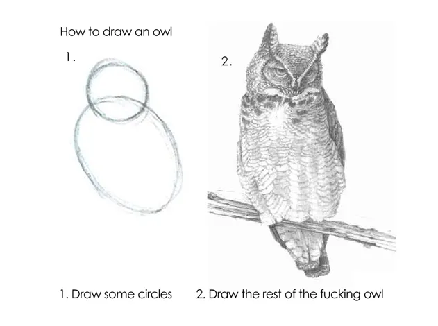
The Rest of the Owl
After implementing more enums to handle size and style, we’re left with an initialiser that looks like this:
    public init(type: MyButtonType = .primary,
                color: MyButtonColor = .`default`,
                size: MyButtonSize = .large,
                icon: MyButtonIcon? = nil,
                title: String,
                action: @escaping () -> Void) {

        self.type = type
        self.color = color
        self.size = size
        self.icon = icon
        self.title = title
        self.action = action
    }
We’re embodying the principles of progressive disclosure here:
- The call site hides non-essential details, and can be used exactly like a default SwiftUI
Button, with a title string and an action, but developers can customise it easily when needed. - When customising the button, Xcode autocomplete for our enum cases means that even somebody new to your project can intuit which properties they should set to match the design.
- Intelligent default values in the initialiser arguments mean that the most common use case — a large, blue, filled button, with no icon — is the easiest to create.
- Consumers of our API can customise the button with any icon they choose by adding an associated value to the icon enum.
Let’s see this in action.
When we actually use the button in our Views, we can invoke it with no customisation:
MyButton(title: "Press me!", action: { didPressButton() })

Or we can utilise all the features we’ve set up for a more customised button:
MyButton(type: .secondary,
         color: .accent,
         size: .small,
         icon: .trailing(.Icon.profile),
         title: "Press me!",
         action: { goToProfile() })

Please take a look at the full sample code for MyButton on Github, along with a mini-project displaying all the possible variants in a design library.
Conclusion
Through building MyButton, not only have we created a useful UI component – we’ve hit on many of the powerful features of the Swift type system:
- Enums to help us define specific customisation options
- Computed properties inside enum definitions which switch over the cases
- Associated values in enum cases to allow for full customisation
- Default parameters in the
MyButtoninitialiser offers progressive disclosure - Optional properties allow us to avoid using functionality we don’t need
I hope after reading this, you will think about utilising Enums in your code to bring design systems to life in SwiftUI.
Source: Medium


