 Blogs
Blogs
8 Psychology-Based Design Hacks That Will Make You A Better UX Designer
If the first thought that crossed your mind when you read the title of the article was “What does Psychology has to do with UX Design?“ then, yes, that’s what we thought too, now that we’re on the same page, let’s end this article here. Cheers!
Okay! Jokes apart. The question is what’s design psychology and how and why it is relevant to creating a better UX? Design psychology typically is a combination of the disciplines of Design, Human Interaction, and Human Behavior, and in this article, we’ll discuss the psychological factors that impact the UX of a product or service, and how it could help businesses create better-performing experiences for their products.
User Experience & Psychology
UX design & Psychology have a long-term relationship (social, behavioral and cognitive). Most of the human actions are driven by motivation and competition. According to Maslow’s Theory, humans crave for psychological needs before any other basic need, and the motivation to fulfill other needs come right after they have met psychological needs. Similarly, for design, any UX to work it must meet the primary need of a working functionality with a reliable and consistent experience to provide motivation for any user to continue using the product or service.
A designer who doesn’t understand human psychology is going to be no more successful than an architect who doesn’t understand physics.
— Joe Leech, UX Consultant & Author of book Psychology of Designers
Here are 8 psychological hacks that could help you become an awesome UX designer and create engaging UX:-
1. Please! Stop Repeating My Actions
Try to recall that last you yawned, most of the time people next to you also end up yawning. No, yawning is not contagious as there’s no scientific evidence to back it. On the contrary, it could be a physiological phenomenon called mirroring reflex, and the official term for it is the Chameleon Effect.
Remember how sometimes you’re watching a video or listening to someone talk and you subconsciously nod your head in agreement? Especially when someone close to you is talking. You do this to make the person feel that you’re reacting and showing empathy towards him/her.
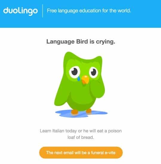
Duolingo, shameless or smart? In my opinion, smart. Combining a perfect copy with that design of the language bird’s emotions, they’re trying to emulate emotions into their users.
That’s why designers embark upon designing emotional interactions in their products because as humans, we feel when we use a product or let’s say interact with a screen. Using emotional interactions, designers are capable of changing our emotions based on how the product wants us to feel.
2. That Must Be Nice Because It Looks Good
People who tend to lack technical understanding about a particular niche of technology, judge the outcome or product from how it appears aesthetically to them. This phenomenon is called the Aesthetic-Usability Effect.
Emotional factors that navigate you to make such conclusions could be anything, a photograph you liked, maybe, the design that has your favorite colors or a cool animation that caught your eye.
Such aesthetic designs, immensely likable, but nowhere to be seen, why? Usability. How good and sexy the design may look, but it is vital for designers to tick the checkbox of sustainable usability i.e. ease of usage, and that’s why such beautiful designs are hardly ever implemented.
Eventually, when these designs fail to perform, users usually end up blaming themselves for incorrect usage. The positive emotional responses tend to overlook the lack of sustainable functionalities.
3. Oh! Thank You, I needed that Assurance
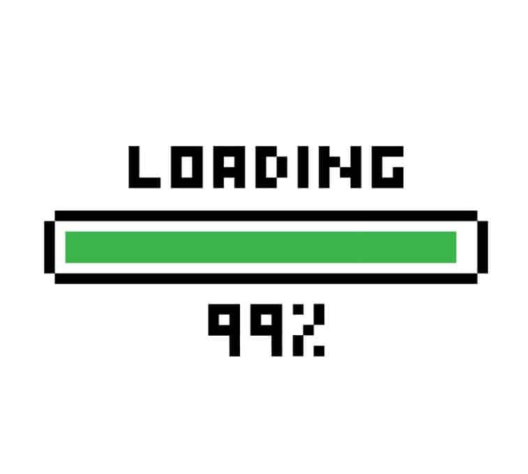
Have you ever seen a loading screen stuck at 99% and thought “Maybe I should just wait a while longer” but that wait, never ends, or does it? Okay, maybe sometimes it does, but it has happened to every one of us.
Many doctors have claimed that patients sometimes are given substances having absolutely no therapeutic value, but the patients believe they’re getting clinical help and eventually end up feeling better. This phenomenon is called the Placebo Effect.
You could easily be a victim of it, and a very subtle example of this is the “Pull-to- Refresh” animation. Technically, users have no control over the pace at which the page or screen loads, but designers have put-in that animation to let users into believing that a page refresh is happening and the screen will load in almost no time.
Reality is that the page or screen will load at the same pace irrespective of the user makes that action or not. The animation is there to provide users a sense of assurance. Until no harm is caused, some cheeky trickery can help designers achieve more engagement from the users.
4. Did I Just Hear Someone Call My Name?
How often does it happen that you’re having a couple of drinks with your co-workers trying to engage yourself in an uninteresting conversation, and suddenly you hear someone mentioning your name in some other conversation? How were you able to hear your name from a conversation that you weren’t a part of?
This is a psychological phenomenon and it is called the Cocktail Party Effect. Remember how you buy a new car and then every time you see the same model pass by, in your mind, you’re like- “How come so many people bought this car after I bought it?”, this is exactly that.
Smart designers and to some extent even copywriters understand this effect and use it to grab your attention. If you use a smartphone, you probably know how accustomed you’re to check your phones for notifications at regular intervals, and how sometimes you’d latch-up the device on the sound of a mobile notification.
Smart copywriters use your name in their copies to grab the attention. You might have seen your name used in email subjects and sometimes on the top left corner of webpages as a form of greeting, these all are a form of tiny gimmicks designers and writers do to keep you engaged.
5. One Simply Doesn’t Listen To The Middle Child
You probably might have read about the middle child syndrome, it’s a psychological condition that exists in children who are born after and before a child i.e. the in-betweeners. Children with this syndrome often feel left out and secluded from their families.
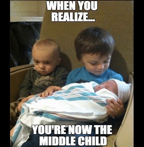
A very similar psychological effect can be observed when it comes to remembering stuff among humans, it is called the Serial-Position Effect. This is term demonstrates that people tend to remember only the first and the last part of a series they just saw or read, and often neglect the middle part.
Designers use this effect to position items in a sequence for accurate recall. They manipulate the serial -position effect to create a better user experience and the use of this effect could be seen in popular brands like Nike, Apple, etc.
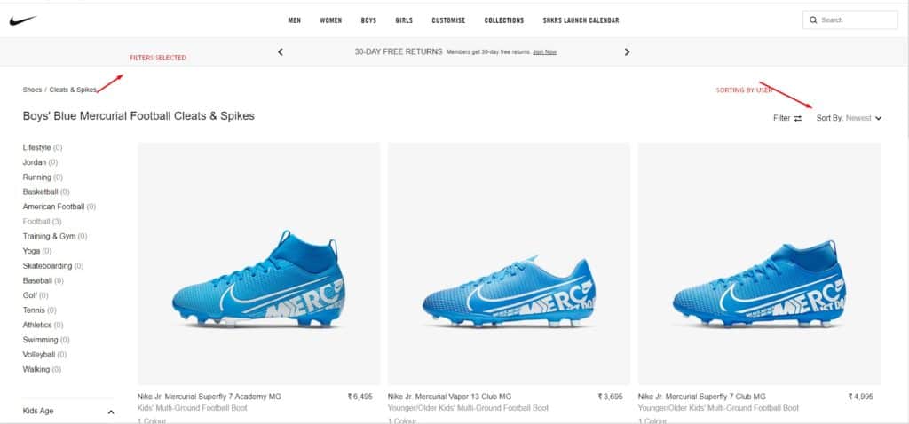
Human memory is limited, especially storing information for the short-term. Nike uses filters to limit the amount of recall required by retaining the information on all significant pages. Retailers are well aware of the fact that it is vital to keep users informed throughout the user’s journey of purchase.
6. Yes, Over Here, Right Next To 50 Odd People. Can’t You See?
Whenever a user is prompted with multiple stimuli, he/she in most cases will take longer to choose one from the options available. This finding was discovered by British and American psychologists William Edmund Hick and Ray Hyman, and it was named after them- Hick’s Law.
Users don’t want to be bombarded with choices, with more options, they’ll need more time to interpret and make decisions, forcing them to work their mind, which they don’t want.
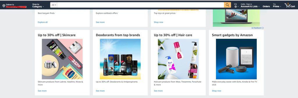
As you can see from the above image that even though there’s an option to search for products using the “Shop By Category” option, Amazon places its emphasis on the search bar to make sure people find what they’re looking for, almost instantly.
Designers value the user’s time and understand the fact that the individual is not obliged to stay on their website. Hence, designers use techniques like compartmentalizing, categorization, simplification of complexity, etc to keep them engaged.
7. You Look Familiar, So I Guess I Know You
You’d have observed that people opt for choices that appear familiar to them, for example, people who’ve used the iPhone tend to continue using it or upgrade only when a better version of it is available, you’d hardly see any iPhone user upgrading or switching to an Android experience. Humans tend to develop this psychological preference due to familiarity with the product or experience. This is called the Mere-Exposure Effect.

Smart designers come up with strategies where they place the CTAs at positions on the screen that are habitual for an average user to look at, or at positions where users navigate their mouse pointers involuntarily. For example, designers place the “next” button on the top right corner of webpages because they know the user will search for the “home” button there. That is the reason you’ll see most of the CTAs and action catches like the User Profile and Notification Icons on the right top corner.
8. Cancel, OK & The X- The Trilogy
Designers use the method of redundant actions to provide users an illusion of control. Designers create this situation to make users believe that they’re the ones with their hands on the steering. This lets the users feel confident about the possibility of the outcome. Psychologists have confirmed that we as humans tend to become anxious if we cannot pre-determine the events of our life-course.
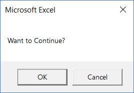
One of the simplest examples of this is the “X” button on the dialog boxes. In reality, the user has only two options to choose from, i.e. either cancel the action or click the “OK” button to continue. Meanwhile, there’s another “X” button which has the same functionality as the “Cancel” button, but for users, it translates into “I’m not sure, hence I don’t wish to make a decision.” Designers use these small tricks to keep users engaged and happy.
Conclusion:
These are some mere techniques that designers use to create an experience that’s interactive. Only through intense UX research and observing the behavior of users can one design a great User Experience.
A feeling of control is essential for every one of us. Thus, while designing, all UXers should always be empathetic towards their audience. Sometimes the feeling of control is more vital than having the control itself.
Source: Usability Geek


