 Blogs
Blogs

Eye-Opening Examples of Good & Bad UX Design
Understanding the makeup of good and bad user experience can be subjective and hard to pinpoint. Thankfully there are a number of guiding principles that can give us direction in understanding what makes for a good user experience.
Understanding those principles is one element, seeing how they reveal themselves in practice is another element of understanding good versus bad experiences. In this article we’ll explore some good ux design examples, as well as some examples of bad ux, and how principles like the Nielsen Norman Heuristics are represented in the real world.
Demonstrate current state
As one of the heuristics developed by Jakob Nielsen, visibility of system status states that users should be informed about what is happening inside a product or website, in a reasonable response time following the action.
This means that applications that don’t provide timely feedback as to what the system is doing may create a more negative or confusing experience. Take for instance the action of saving a document. As a user when you click save, you want to be able to know whether your action was recognized. Delaying, or not showing a response to the action leaves a user questioning.

Using clear, understandable language
A good user experience is one that speaks to the user with words they understand, and take action on. Often highly specialized applications can fall into the trap of using highly technical jargon that only experts may understand. Even if a user understands, or can make sense of the terminology, in a high-stress situation like an industrial manufacturing plant, highly technical language can lead to user-error and costly mistakes.
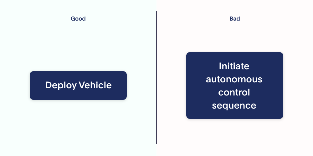
In this example, the controller on the right uses technical engineering language to describe the action an autonomous robot is going to take. On the left, the action is translated into recognizable, human-readable language. The one on the left is less prone to misunderstanding.
Effective use of color and hierarchy
Though the visual aesthetic of a product may not be the top priority in a user-experience process, ignoring visual design can lead to bad experiences. The practice of pairing thoughtful experience design with clear, hierarchical visual design can create enjoyable, easy to understand digital experiences that lead to higher effectiveness.
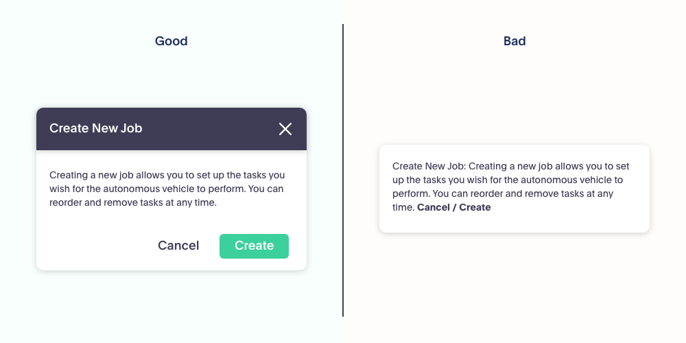
In this example the same information is available, in human-readable language. However, the example on the right has no form, no sense of hierarchy, and the use of color has no intention or logic. On the left, typography and color come together to structure the information in a way that provides the reader direction, and a sense of importance in the content.
Reduce errors
Mistakes and errors happen, it’s nearly inevitable. Whether someone runs a sequence that uncovers a rare bug, or the wrong button is clicked before the action should be completed, our products and experiences have to be able to handle errors. Good user experiences not only inform a user when an error has occurred, but they also actively design to prevent errors from happening in the first place.
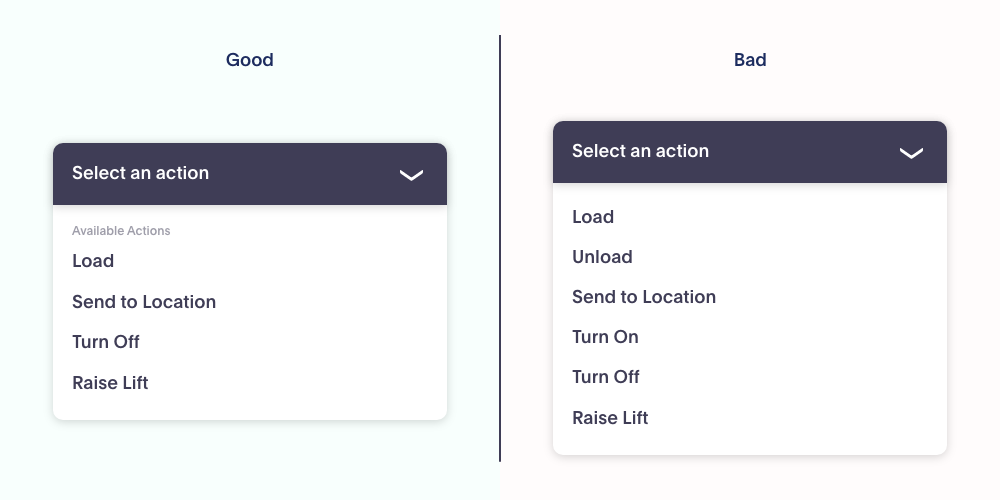
One common way of promoting errorless use is to hide actions and options that are invalid. A great example of this is with selecting actions from a dropdown menu. Consider once again an industrial system that relies on particular parameters for certain actions. If an operator tries to dispatch an unload command on a vehicle, for that to work, the vehicle must have a load. If all options are available, and an operator clicks “Unload” they’re going to get frustrated when the system tells them this failed. Instead, the system should recognize that the action is not possible, and hide it from the selection.
Communicate errors and next steps
When the inevitable errors happen, it’s important to communicate to the user. Language, tone and design is important in these communications. It is important to provide a clear and understandable reason for an error (where possible), and give instructions so that the error can be remedied. Leaning on technical language, or database error terms will not be beneficial to the user. Color is also important as it can help indicate the severity of an error or warning.
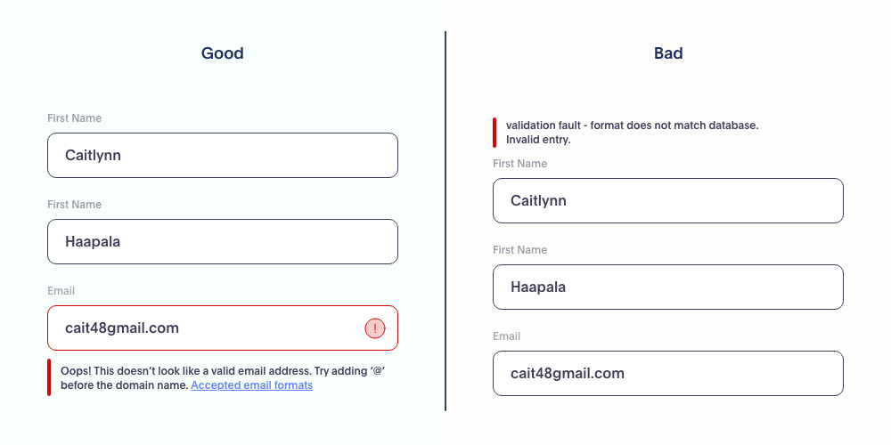
In this example, the same error has occurred in both instances. However on the right the error has been passed through from the backend system with no filtering or translation. On the left, a translation has occurred and the error message contains a link to relevant in app help modules, or external documentation. Having the clarity of a translated message, highlighted in context, and access to precise documentation can help a user troubleshoot and remedy an error much faster than cryptic codes.
Also of note is the positioning and context of error messages. Feedback like inline validation should be contextual to what it is reporting on. In the bad example that error could apply to any of the fields, or to nothing at all. In the good example we can see the correlation as the troubled field is highlighted in the same error color to indicate the message is referring to it. Furthermore the message is nested directly below the field.
Keep the audience in mind
There are many examples of both good and bad user experiences, if we were to show examples of all, we’d have to write a multi-part book series. The important thing to remember is to follow guidelines and principles that exist. Following conventions, and thinking through what makes the user’s life easier rather than what the code dictates will get you one step closer to a good user experience.
Source: XD Ideas


